FITPET
2019
Branding / Package / Web
Designed from.
Creative director : Doohyun An
Design : Sohee Park, Seoyeon Park
Pop-up store : Arkitag
PETHROOM PRODUCTS & PACKAGES
2018–2021
Branding / Charater illustration / Product / Package / Prints
Designed from.
Creative director : Doohyun An
Design : Sohee Park, Jooyeon Lee, Shinhyung Kim, Seoyeon Park, Seunghyun Ryu, Dawn Joo
FITPET
2019
Branding / Package / Web
Designed from.
Creative director : Doohyun An
Design : Sohee Park, Seoyeon Park
Pop-up store : ARKITAG
핏펫은 IT기술력을 기반으로 반려동물의 삶의 질을 높이는 브랜드이다. 간단한 건강검진을 할 수 있는 소변검사 키트나, 비문을 활용한 기술력 등이 메인 서비스인데, 기존 로고는 테크니컬한 형상으로 브랜드의 아이덴티티를 나타냈다. 그러나 우리는 핏펫의 기술력이 이미 인지도가 높은 점을 착안하여, 반려동물을 가족처럼 여기고 건강을 챙기고자 하는 소비자의 마음에 집중을 하여 감성적인 브랜드 아이덴티티를 구축했다. 기존 로고는 얇은 선으로 구성되어있어 식별성도 떨어졌기 때문에, 반려동물의 건강의 척도인 코를 형상화한 솔리드 형태의 로고를 디자인했다. 또, 신뢰성 높은 블루 컬러를 사용해 핏펫이 수의사와 함께하는 전문성을 갖춘 브랜드임을 강조했다. 이 로고를 바탕으로, 쇼핑몰과 제품에 해당하는 서브 로고 및 패턴을 만들어 브랜드의 통일성이 지루하게 느껴지지 않도록 했다.
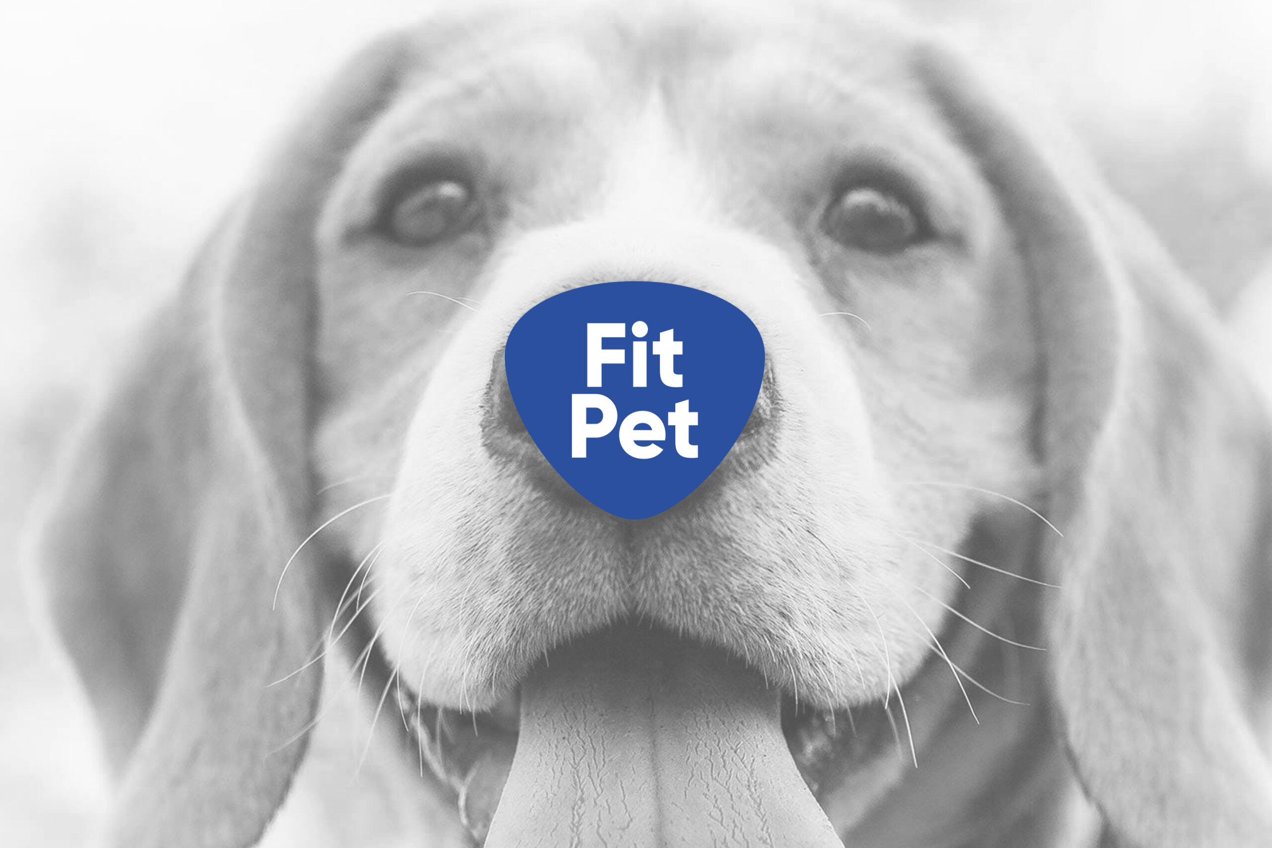
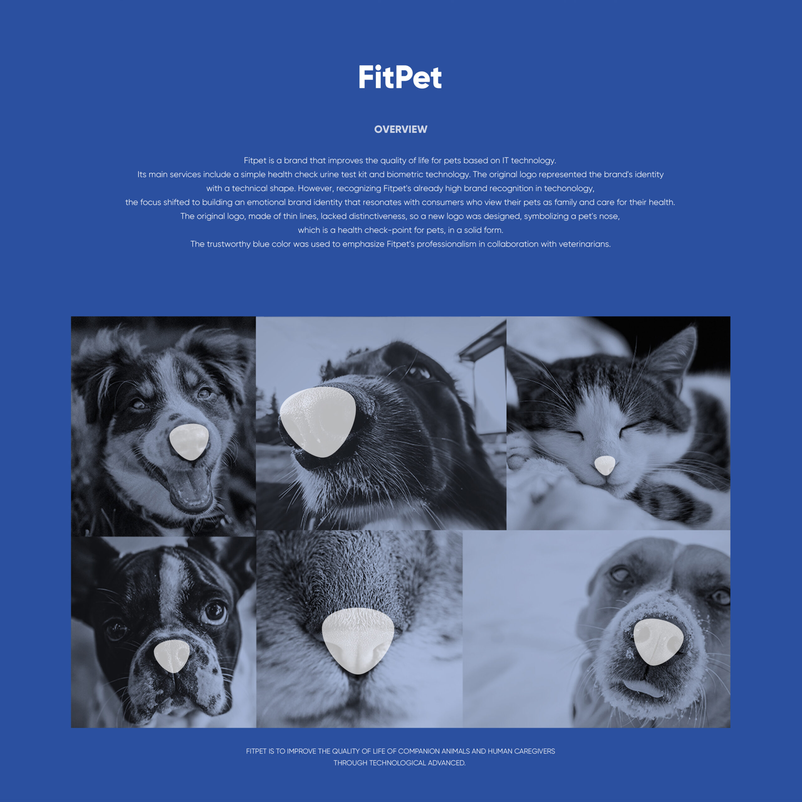
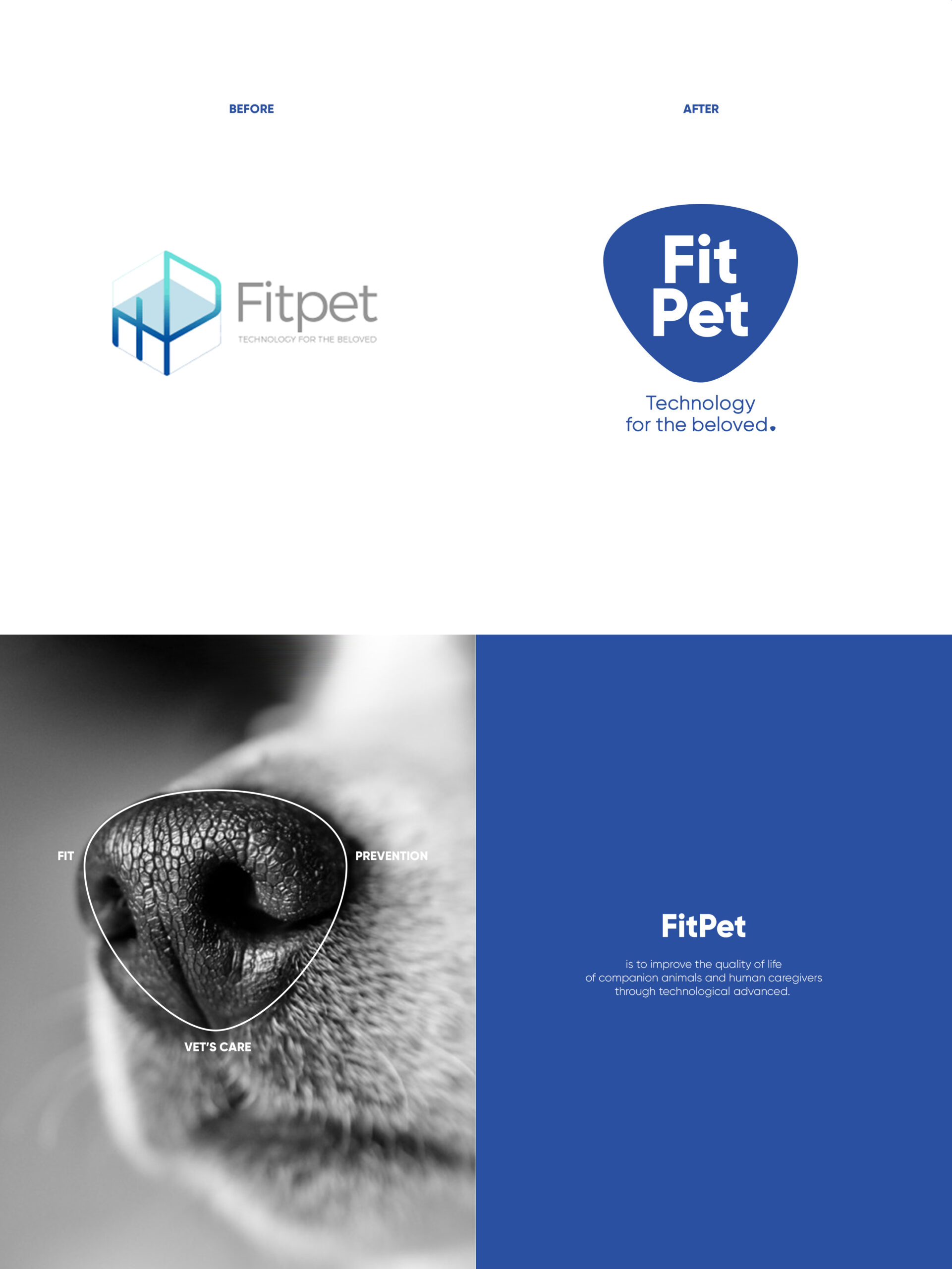
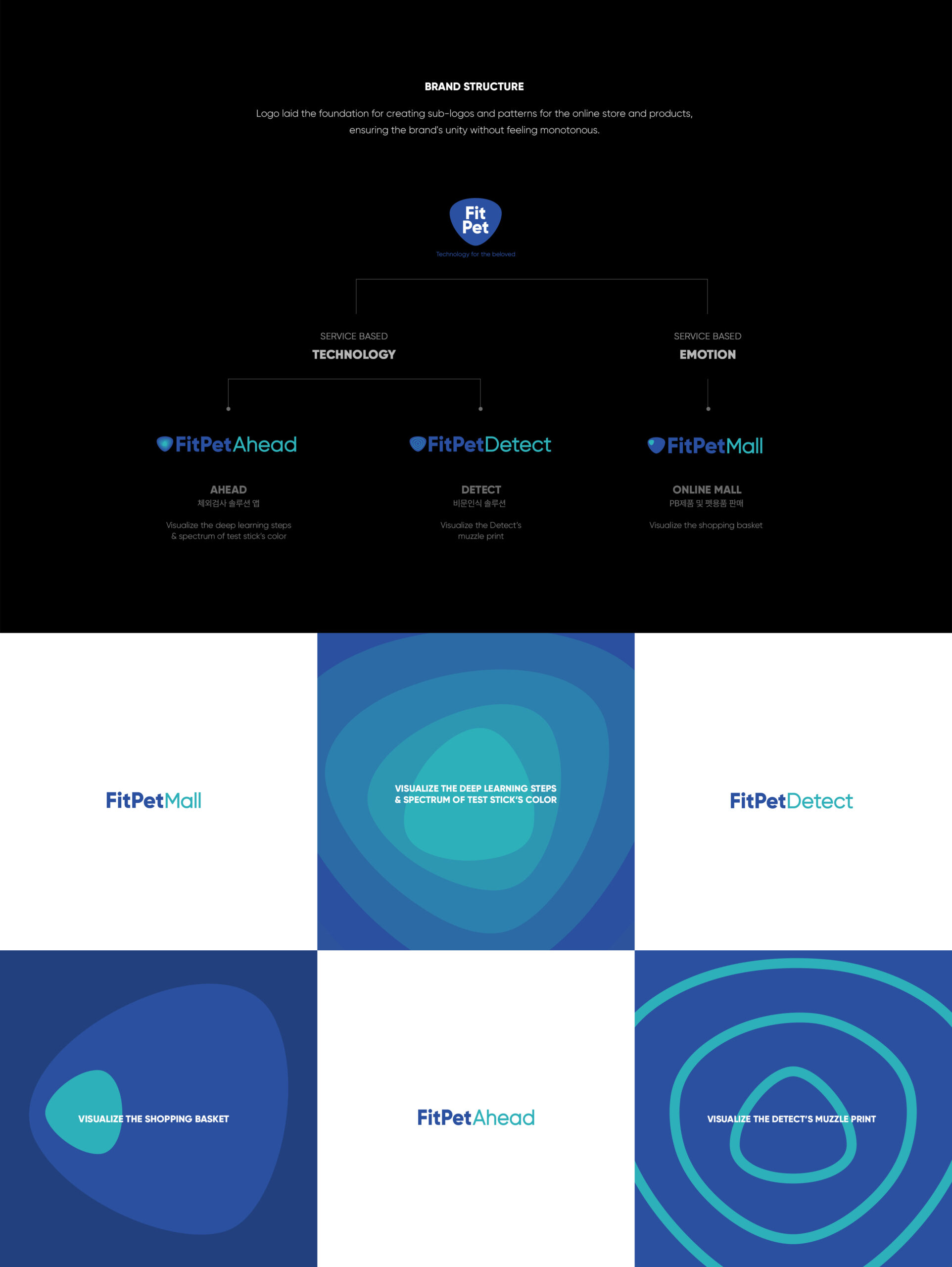
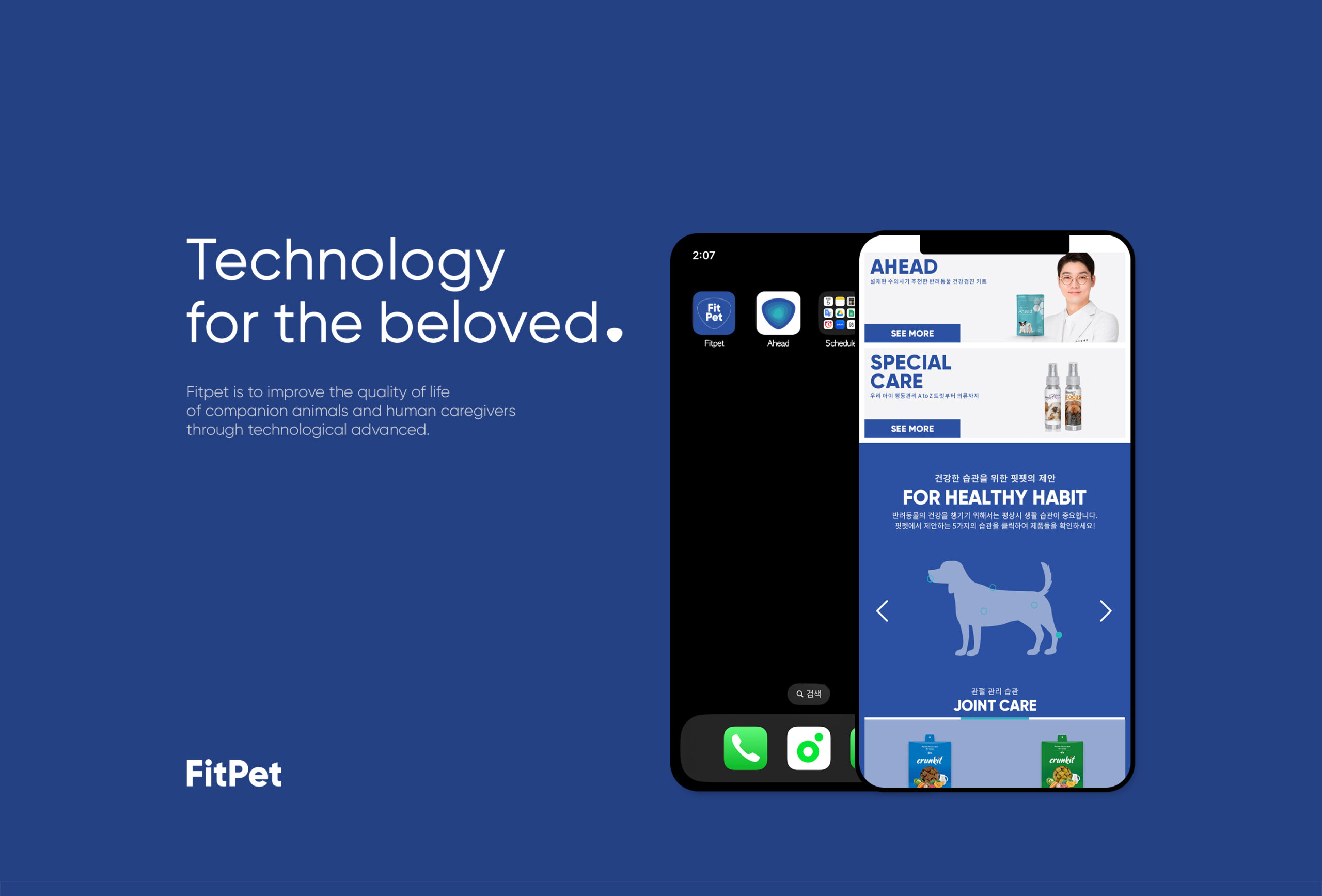
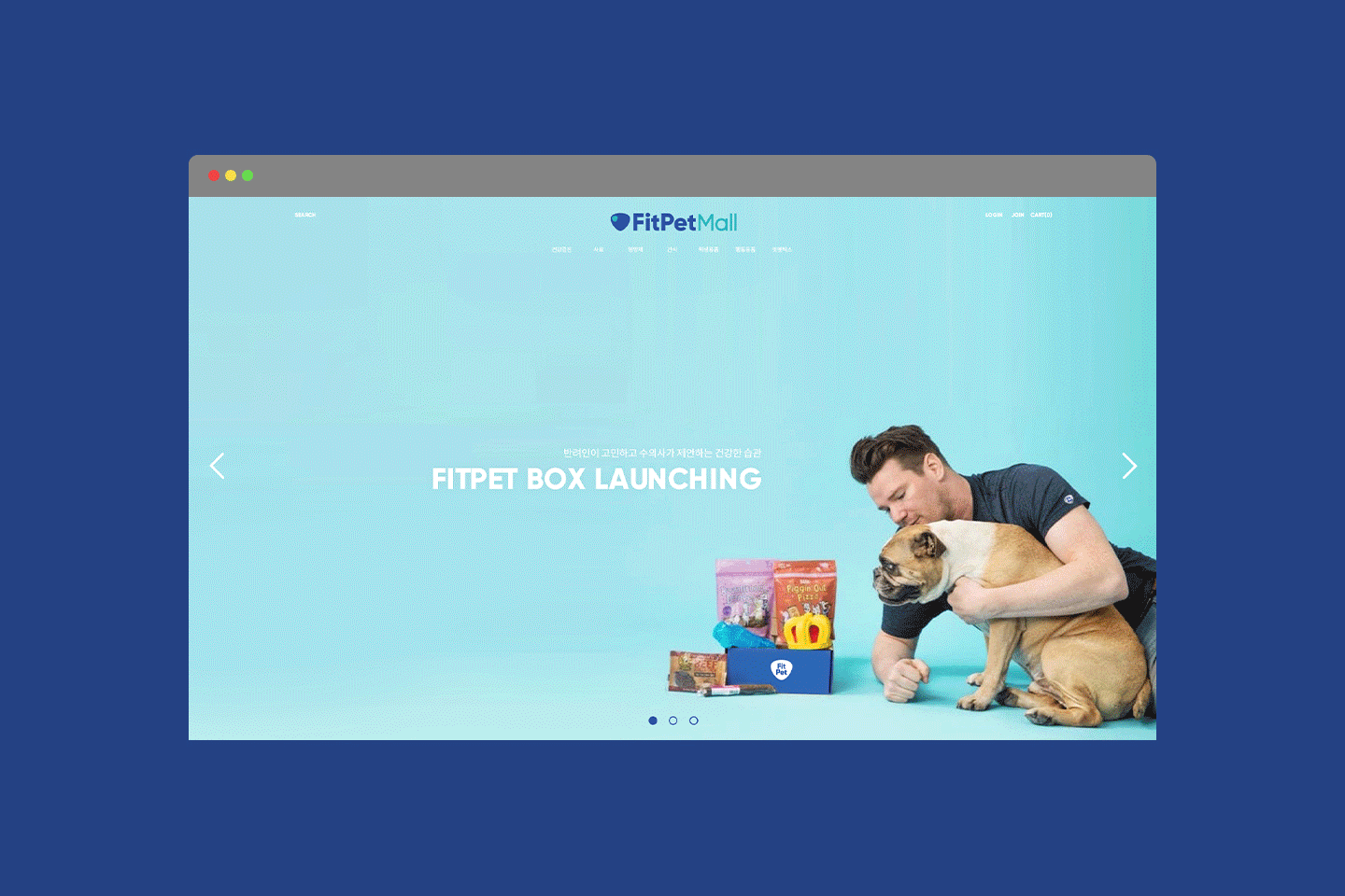
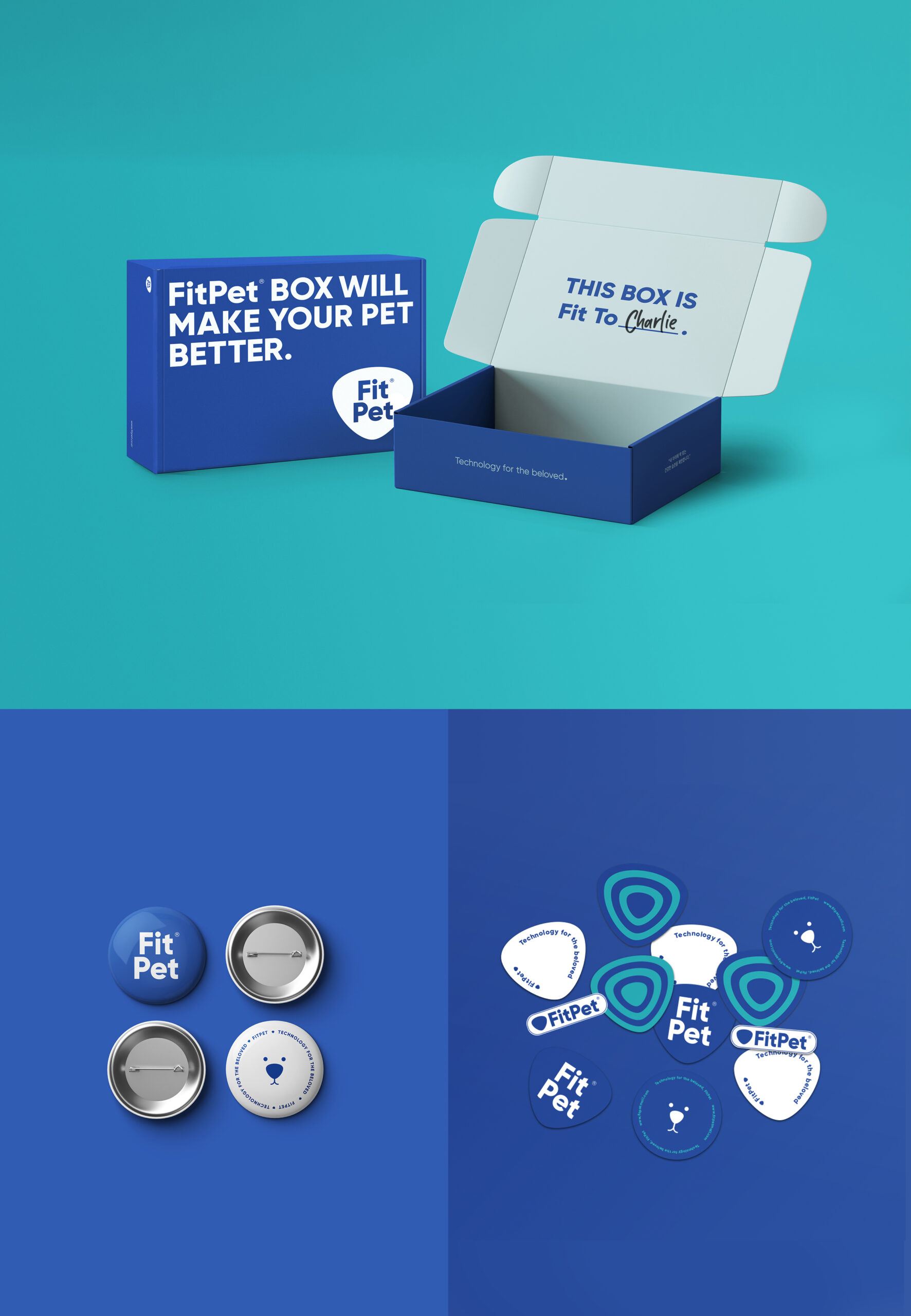
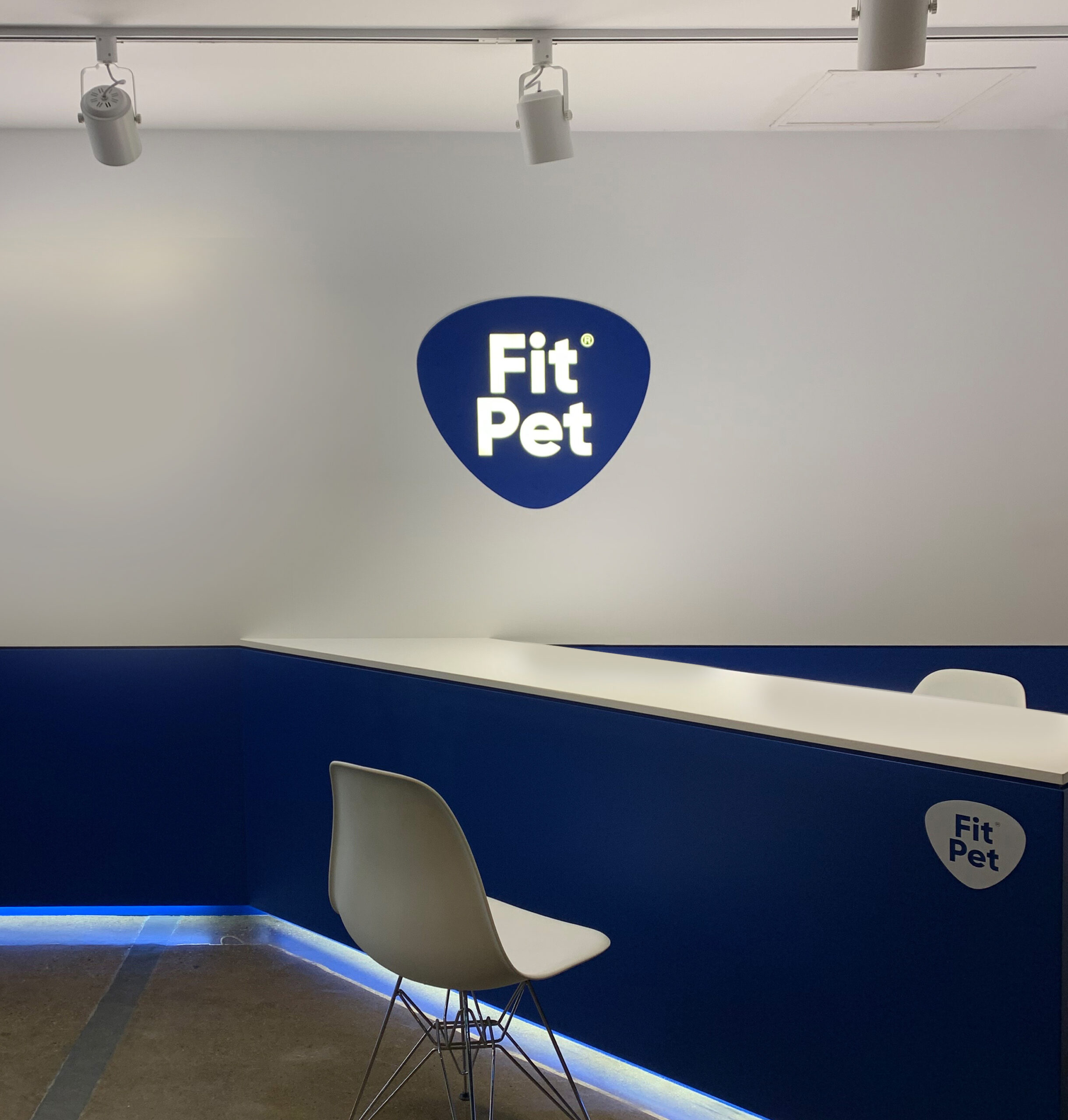
Fitpet is a brand that improves the quality of life for pets based on IT technology. Its main services include a simple health check urine test kit and biometric technology. The original logo represented the brand’s identity with a technical shape. However, recognizing Fitpet’s already high brand recognition in techonology, the focus shifted to building an emotional brand identity that resonates with consumers who view their pets as family and care for their health. The original logo, made of thin lines, lacked distinctiveness, so a new logo was designed, symbolizing a pet’s nose, which is a health check-point for pets, in a solid form. The trustworthy blue color was used to emphasize Fitpet’s professionalism in collaboration with veterinarians. This logo laid the foundation for creating sub-logos and patterns for the online store and products, ensuring the brand’s unity without feeling monotonous.